
by 20% using focused ICP pages
B2B SaaS
We were engaged to revamp the Property Management use-case page—one of TwoDots’ core revenue drivers—and give it a visual identity that feels polished, intentional, and instantly clear to the ICP (portfolio and onsite property managers).
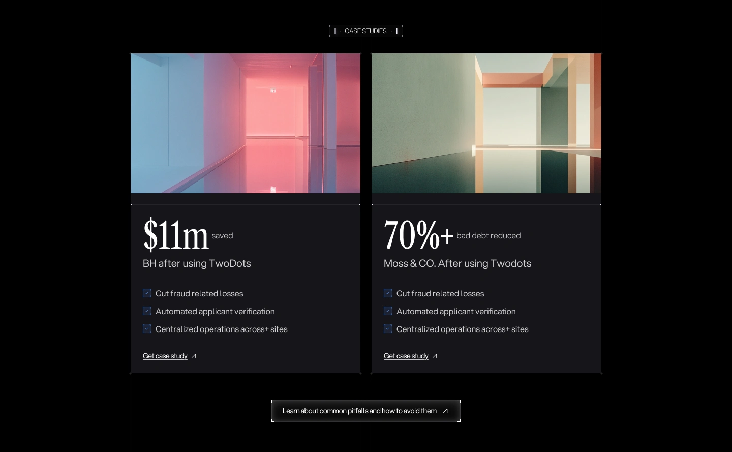
A cohesive, enterprise-ready page that tells the story in seconds: clear value prop, tighter information architecture, and animations that do the heavy lifting for comprehension. The new system is reusable across other use-case pages, performs well across devices, and gives sales and marketing a credible link to share.


The existing page leaned on a playful mascot style and dense copy. It didn’t quickly show how the chat-based workflow gathers information from tenants or why TwoDots is the safest, fastest path to approvals.
We needed to balance clarity, credibility, and conversion without adding cognitive load.
We evolved the visual identity to a more mature system, and created two product animations that demonstrate the chat assistant extracting the right details from tenants and handing them to screening. The page was rebuilt with crisp hierarchy, proof points, and focused CTAs—optimized for speed and accessibility.
🎨 Design Direction
- Elevated identity that nods to the TwoDots character while feeling more enterprise:
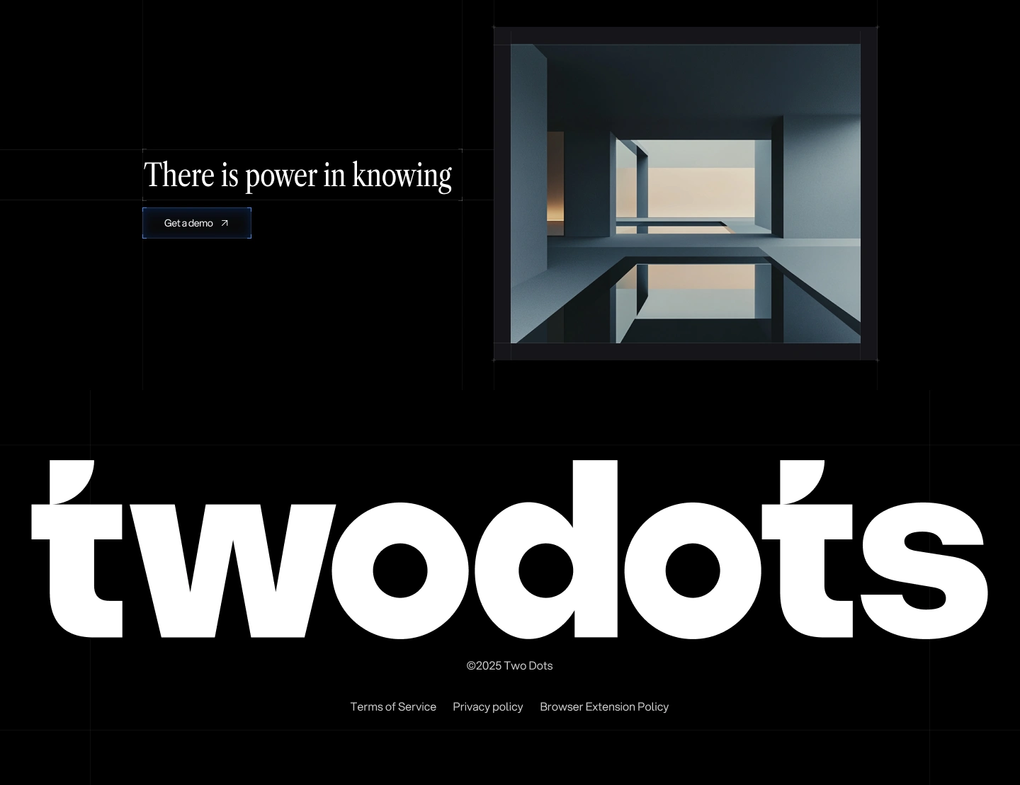
- High-contrast dark UI, precise grid, refined iconography, and depth through subtle lighting.
- Built a responsive component system with consistent spacing and accessible contrast.
✨ Animations & Interactions
Built two signature animation styles to reinforce the product story:
- Phone Chat Simulation – Demonstrating the AI assistant in action as it verifies and approves applicants.
- Conceptual Clock Animation – A symbolic illustration of 24/7 automation and the “always working” value proposition.
- Layered in subtle micro-interactions and hover states for an engaging, premium browsing experience.
⚙️ Development
- Implementation with performance in mind: semantic structure, responsive components, optimized media, and clean embeds for the animations.
- Rigorous QA across breakpoints and browsers, with attention to accessibility and page speed.
%20(2).png)
Brand Design, Webflow Development, Creative Designer, Animator, Project Manager.
Design: Figma
Development: Webflow
Animations: Adobe After Effects, Bodymovin Plugin, Lottiefiles.com
.jpg)